Your novel's cover is your best salesperson: the reader decides in a couple of seconds whether to click, and almost always does so because of the image. A good cover conveys the genre at a glance, has a large, legible title, a single quality image and at most two typefaces. Design at high resolution, respect the print margins and avoid the typical mistakes —small title, clutter, low resolution— that give a beginner away. In this guide you'll see the key elements, the role of colour and genre, and how to create your cover step by step.
You've finished your novel, edited it and you're about to publish. And then comes the question many authors underestimate: what about the cover? Let me be blunt: the cover isn't decoration, it's the single most important marketing tool your book has. In a store like Amazon, your novel competes as a stamp-sized thumbnail among hundreds of others, and the reader judges in an instant. A professional cover invites the click; an amateur one sinks even a great manuscript. The good news is that designing a good cover isn't magic, just a matter of following some principles. If you're still finishing the book, keep our guide on how to write a novel handy; here we focus on dressing it to sell.
Why the cover sells your novel
Even though the saying goes that you shouldn't judge a book by its cover, we all do. The cover is the first thing a reader sees and, in digital retail, almost the only thing they look at before deciding whether to keep looking. Its job isn't to be pretty in the abstract but to do three things: grab attention amid the competition, immediately convey the genre and tone, and project professionalism so the reader trusts that there's a polished work inside. If your cover fails at any of the three, you lose sales before anyone even reads your blurb.
The elements of a good cover
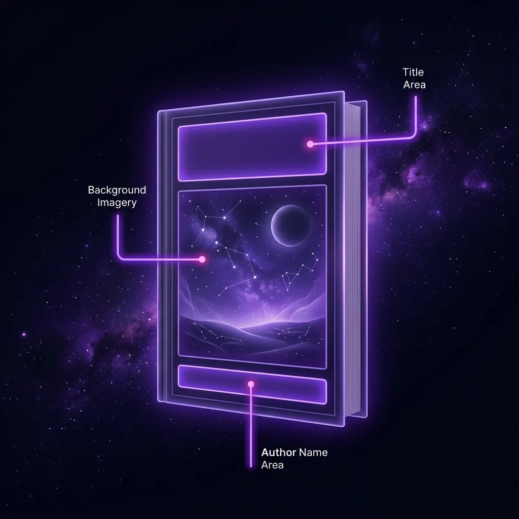
An effective cover is made of few elements, well prioritised. These are the essentials:
- The title. Large, legible and the first thing read. It's the most important element after the image.
- The author's name. Its size depends on your brand: if you're a recognised author, large; if you're starting out, more discreet than the title.
- The image or illustration. A single one, of quality, that captures the essence and genre of the story.
- Visual hierarchy. The eye should travel the cover in a clear order: usually image → title → author.
- Breathing room. A good design needs space; don't fill every gap.
And don't forget the difference between formats: the ebook cover is just the front, whereas the print edition needs a full wraparound cover with front, spine and back, calculated from the book's thickness.
Typography: less is more
Typography is where a professional's eye shows most. The golden rule: use two typefaces at most —one for the title and one for everything else— and make sure they pair well. Three or more almost always muddy the design. Steer clear of ornate "artistic" typefaces: at thumbnail size they become illegible, and legibility rules. The font should also reinforce the tone: an elegant serif for historical fiction, a strong sans for a thriller, a warm script for romance. If the typography contradicts the genre, it confuses the reader.
The image and colour
The image is the cover's magnet, and its quality is non-negotiable: nothing gives an amateur away more than a pixelated or stretched photo. Use high-resolution images (300 dpi if you're printing) and don't distort them. If you turn to stock libraries, avoid the over-used shots; thousands of covers share the same stock portrait.
Colour does a quiet but huge job: it conveys emotion and genre before the reader reads a single word. Reds and blacks for thriller and horror; pastels and golds for romance; greens and ochres for fantasy; cold blues for science fiction. It's not a law, but the reader already has those associations ingrained, and playing with them (or breaking them on purpose) is part of the craft. Working colour harmony is, at heart, the same sensitivity you apply when choosing the point of view or the tone of your prose.
Cover types: illustrated, photographic or typographic
Not all covers are built the same way, and it helps to know which one you're playing with. The illustrated cover uses an original drawing or painting: it carries a lot of personality and dominates in fantasy and young adult, but it's usually the most expensive. The photographic cover starts from one or several images (your own or stock) combined and retouched; it's the most common in thriller, romance and general fiction. And the typographic cover bets almost everything on text and composition, with little or no image; it works wonderfully in non-fiction, literary and established-brand bestsellers. Choosing the right type is, to a large extent, a genre decision: look at what dominates among the books competing with yours before you decide.
Covers by genre
This is the part most first-time authors ignore: each genre has its own visual language, and readers know it. An epic fantasy cover, a romance cover and a thriller cover look nothing alike, and they must look exactly as their target audience expects. Before you design, do your homework: look up the current bestsellers in your genre on Amazon and note their patterns —type of image, palette, typography, composition—. It's not about copying but about speaking your reader's language so they recognise your book as "one of theirs". If you write fantasy or romance, their cover conventions are very pronounced and worth respecting.
To make it concrete, here are some of the visual codes readers expect: fantasy leans on epic landscapes, magic symbols or a lone figure seen from behind against a wide horizon; the thriller loves high contrast, solitary silhouettes, fog and cold or blood-red tones; romance often shows couples, warm colours, floral elements and a handwritten typeface; science fiction reaches for cold blues, technology, ships and wide, empty spaces; and crime/noir prefers stern typography, dark palettes and a single telling detail. These codes aren't a straitjacket but the shortcut by which your reader recognises in two seconds: «this is a book for me». Break them only on purpose, when you know why.
Common mistakes that give a beginner away

- A title that's too small. If it can't be read in thumbnail, it doesn't look like a novel. The title should be visible from afar.
- Overloading with elements. Too many images, fonts or effects. A clean cover communicates better.
- Low-resolution images. Pixelated or distorted; the most glaring mistake of all.
- Illegible typefaces. Ornate "artistic" fonts fall apart at a distance. Simplicity wins.
- Ignoring the print margins. Putting text or key elements in the bleed area that later gets trimmed.
- A cover that doesn't state the genre. Pretty but mute: if the reader can't tell what kind of story it is, they don't buy.
And one last filter before you call your cover done: show it to someone who doesn't know the book and ask what they think it's about and which genre it belongs to. If they nail it in two seconds, the cover works; if they hesitate, you still have work to do. Your opinion counts for little here: the cover is judged by someone who knows nothing about your story.
Where to find your cover image
The image can come from several places, each with its pros and cons. Stock libraries (some free like Unsplash or Pexels, others paid) are fast and cheap, but you risk your photo showing up on ten other covers. Commissioning an illustration from an artist gives you something unique and bespoke, in exchange for budget and time. Your own photos can work if you have the eye and the gear. And AI generation lets you create an image tailored exactly to your story, without depending on what's in a library —always checking the tool's terms of use and licensing—. Whatever the route, the rule doesn't change: high resolution and clean rights so you can sell your book without nasty surprises.
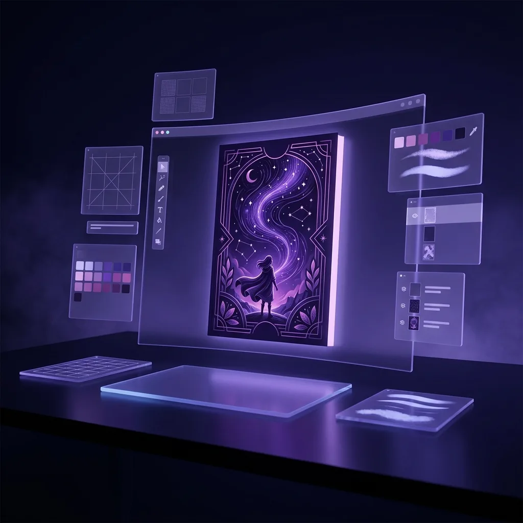
How to create your cover step by step
With the principles clear, you have three paths depending on your budget and your appetite for learning:
- Do it yourself with templates. Tools like Canva or specific cover templates give you a professional base. Ideal to start and for tight budgets.
- Hire a designer. A professional who specialises in book covers brings judgement and craft. The best option if your novel really aims to compete.
- Generate and compose with AI. AI tools let you create bespoke images for your cover without relying on generic stock.
That's exactly where Scriptum's Cover Studio comes in: it helps you generate the image your story calls for and compose a cover consistent with the genre and tone it already knows from your novel, without leaving your writing studio. Building the book and dressing it to sell, in the same place.
Frequently asked questions
What size should a book cover be?
For an ebook on Amazon KDP, the recommended cover is 2560 × 1600 px (a 1.6:1 ratio), in RGB and JPG or TIFF format. For the print edition, the dimensions depend on the book's trim size and page count, because they affect the spine width: KDP generates an exact template with the bleed once it knows those figures. The practical rule: design at high resolution (300 dpi for print) and always respect the safety margins so nothing important gets trimmed off.
Can I design my own novel's cover?
Yes, especially to start with. With tools like Canva, cover templates or an image editor you can achieve a decent result if you respect the basics: a large, legible title, a single quality image, a maximum of two typefaces and a design that conveys the genre at a glance. For a novel that aims to compete, there comes a point where hiring a professional designer makes the difference, but it isn't essential for your first book.
How much does a professional cover cost?
It varies a lot. A premium template or a budget freelance designer can run between 30 and 150 €; a designer who specialises in book covers with original artwork can go from 200 to 800 € or more. Doing it yourself costs only your time. The key isn't the price but that the cover looks professional and suits your genre: an expensive bad cover is worse than a good free one.
Are the ebook and print covers the same?
Not exactly. The ebook cover is just the front (a single image file). The print cover is a complete piece that includes the back cover, spine and front in one extended design, with bleed and the spine width calculated from the page count. The usual approach is to design the front first (which serves for the ebook) and then extend it to the full wraparound cover for print.
What software or tool should I use to design the cover?
It depends on your level. To start: Canva or specific cover templates, very accessible. For more control: GIMP (free), Affinity Photo/Designer or Photoshop and InDesign. What matters isn't the program but the principles: high resolution, clear hierarchy (title and author visible), two typefaces at most and respecting the print margins. Start simple and move up tools as you need to.
Do I need different covers for the ebook and the hardback?
The front design can be the same, but the files change. The ebook uses only the front in a single file. Paperback and hardback share the idea, but each needs its full wraparound cover (front, spine and back) with the spine recalculated for thickness: a hardback is thicker than a paperback with the same page count. KDP gives you a different template for each format; design the front once and adapt it to each cover.
Should I put reviews or awards on the cover?
In moderation, yes, especially if they're strong («Bestseller», a short quote from a recognised outlet or a relevant award). But careful: only if they fit without cluttering and without stealing legibility from the title. At thumbnail size, a tiny review line is noise. If in doubt, save it for the back cover or the product description, where the reader is already reading.
Conclusion: your cover is your best salesperson
You've invested months writing your novel; don't bury it under an amateur cover. You don't need to be a designer: you need to respect a few principles —a large, legible title, a quality image, two typefaces at most, clear hierarchy and a design that shouts your genre— and avoid the mistakes that give a beginner away. Study the covers that win in your genre, simplify, and always pass the thumbnail test. When your cover does its job, it'll lead the reader to the next step: your blurb and your book. And if your manuscript is ready, the final stretch is publishing your novel on Amazon KDP.